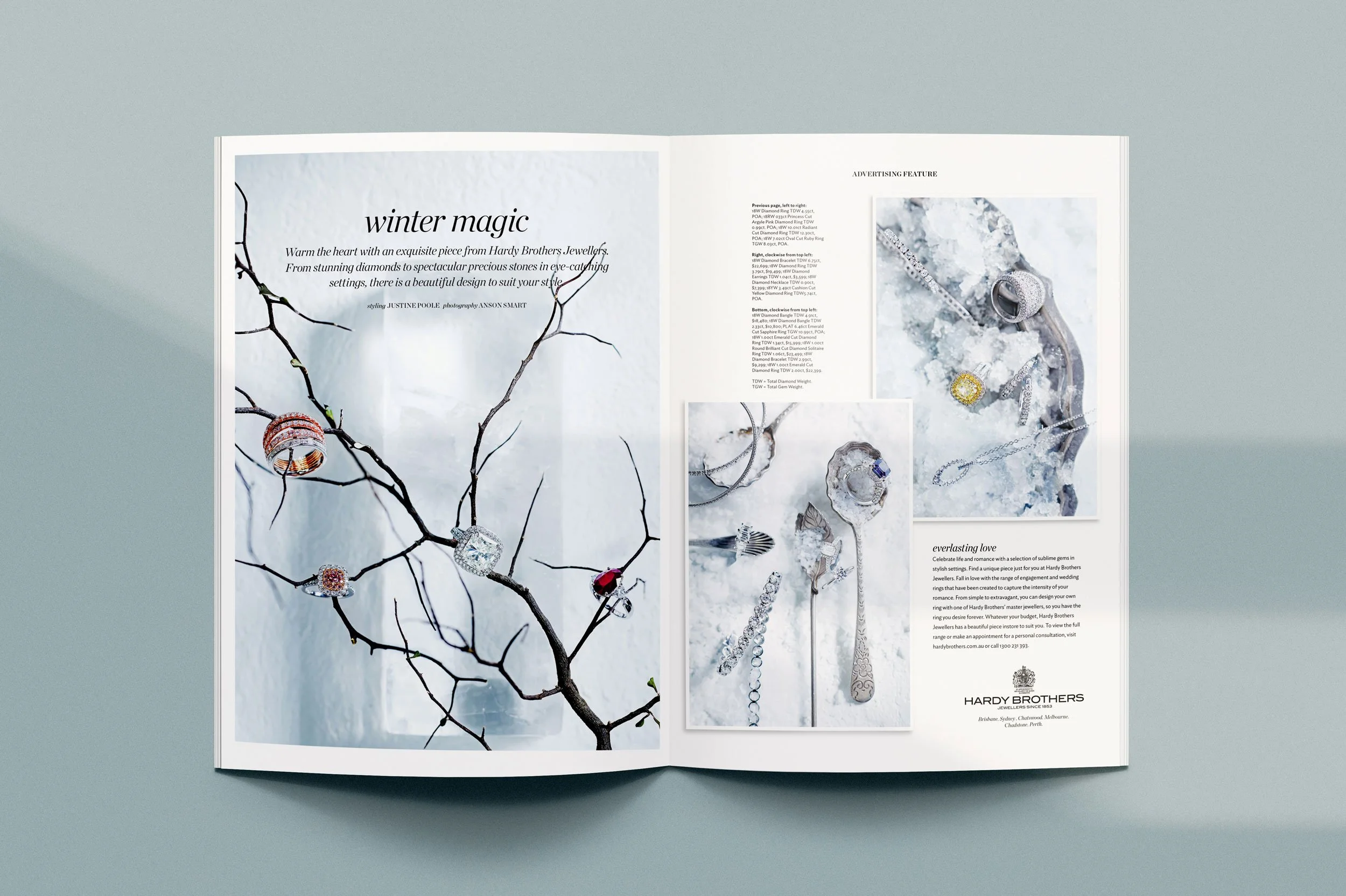
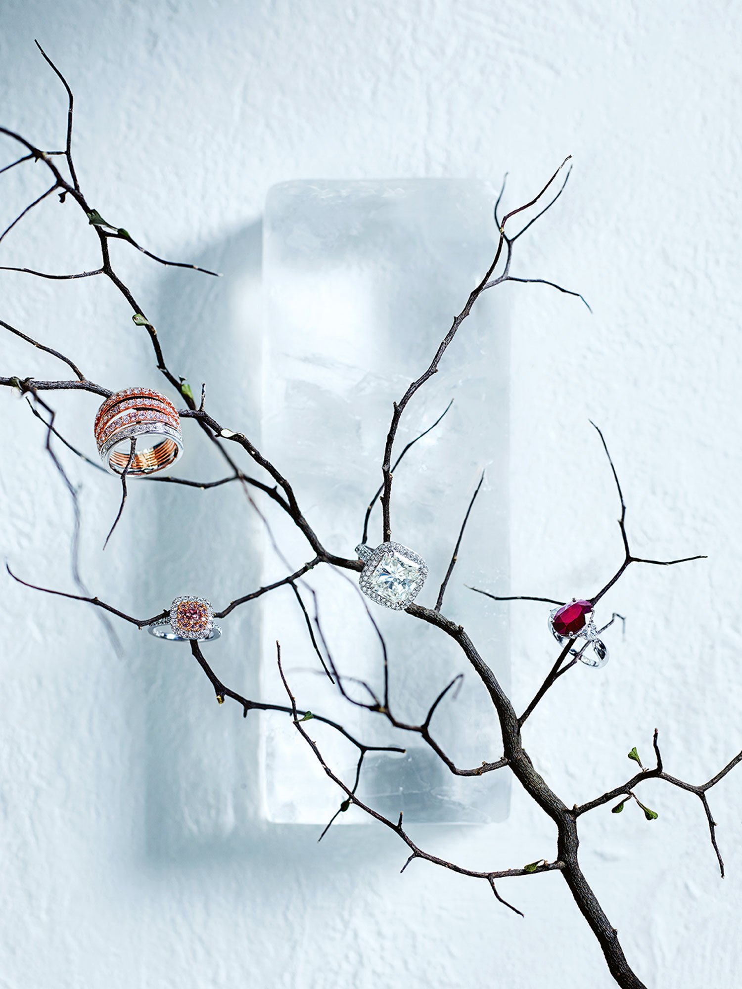
Hardy Brothers x Donna Hay – Winter Print Advertorial
Role: [Creative Concept • Art Direction • Shoot Production • Editorial Layout Design]
Creative Concept
Created for the winter edition of Donna Hay magazine, this advertorial brought together the elegance of Hardy Brothers jewellery with the refined seasonal styling that defines the publication. The goal was to elevate the brand's heritage through rich, cinematic imagery that felt tactile, luxurious, and quietly powerful.
Visual Direction
The visual approach centered on winter as a mood rather than a literal setting - leaning into cool tones, soft shadows, and minimalistic styling to let each jewellery piece shine. Composition and texture played a key role in creating a sense of weight and timelessness, echoing the craftsmanship of Hardy Brothers.
Execution
From shoot production to editorial layout, every detail was designed to align both brands’ aesthetics. The result was a striking full-page spread that captured Donna Hay’s modern editorial voice while showcasing Hardy Brothers’ enduring elegance.
Publication: Donna Hay magazine
Photographer: Chris Court
Stylist: Justine Poole
Discipline(s): Print & Digital magazines